#52Visualisations2026
For my #52visualisations2026 project (inspired by Klaudia Stano), I’ve decided to challenge myself by creating new data visualizations. This project will be an exploration of different topics, techniques, and tools, allowing me to experiment and discover what I find most exciting in the world of data.
1. Less Babies, More Migration in Switzerland
4 January 2026
As my first visualisation in 2026, I wanted to analyse a topic that is at the centre of public debates in Switzerland: population growth and immigration. According to government projections, Switzerland’s population is expected to reach 10 million residents for the first time in 2041.
With birth rates continuing to decline, the Swiss Federal Statistical Office (FSO) projects that from 2035 onwards there will be more deaths than births, meaning future population growth will come entirely from migration.
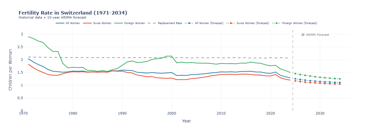
In this visualisation, I focus specifically on birth rates in Switzerland, comparing Swiss and foreign women, and highlighting trends forecasts to better understand how fertility dynamics shape Switzerland’s demographic future.
Key Insights
– Historic Low in 2024: The total fertility rate fell to 1.29 children per woman, the lowest level ever recorded in Switzerland.
– Dramatic Decline: From 2.04 (1971) to 1.29 (2024) – a 37% decrease over 53 years.
– Below Replacement Level: All groups are now well below the 2.07 replacement rate, needed to maintain population without migration.
– Fertility rates are expected to continue declining gradually through 2034
The visualisation was created in Python using a time-series line chart, which allows for clear comparison of fertility trends over time. Historical data comes from the Swiss Federal Statistical Office. To project future trends, I applied an ARIMA forecasting model, a statistical method that uses past patterns in the data to estimate how trends may continue.
2. Moving Data, Moving People
11 January 2026
Today I didn’t open Power BI.
Instead, I decided to play a bit and created a moving visualization in Flourish Studio and what I really like about animated charts is that you don’t need to read the data, you just watch it.
I also decided to stick with the same topic as last week – population. This time, I used population data by canton from the Swiss Federal Statistical Office, covering more than 50 years of data.
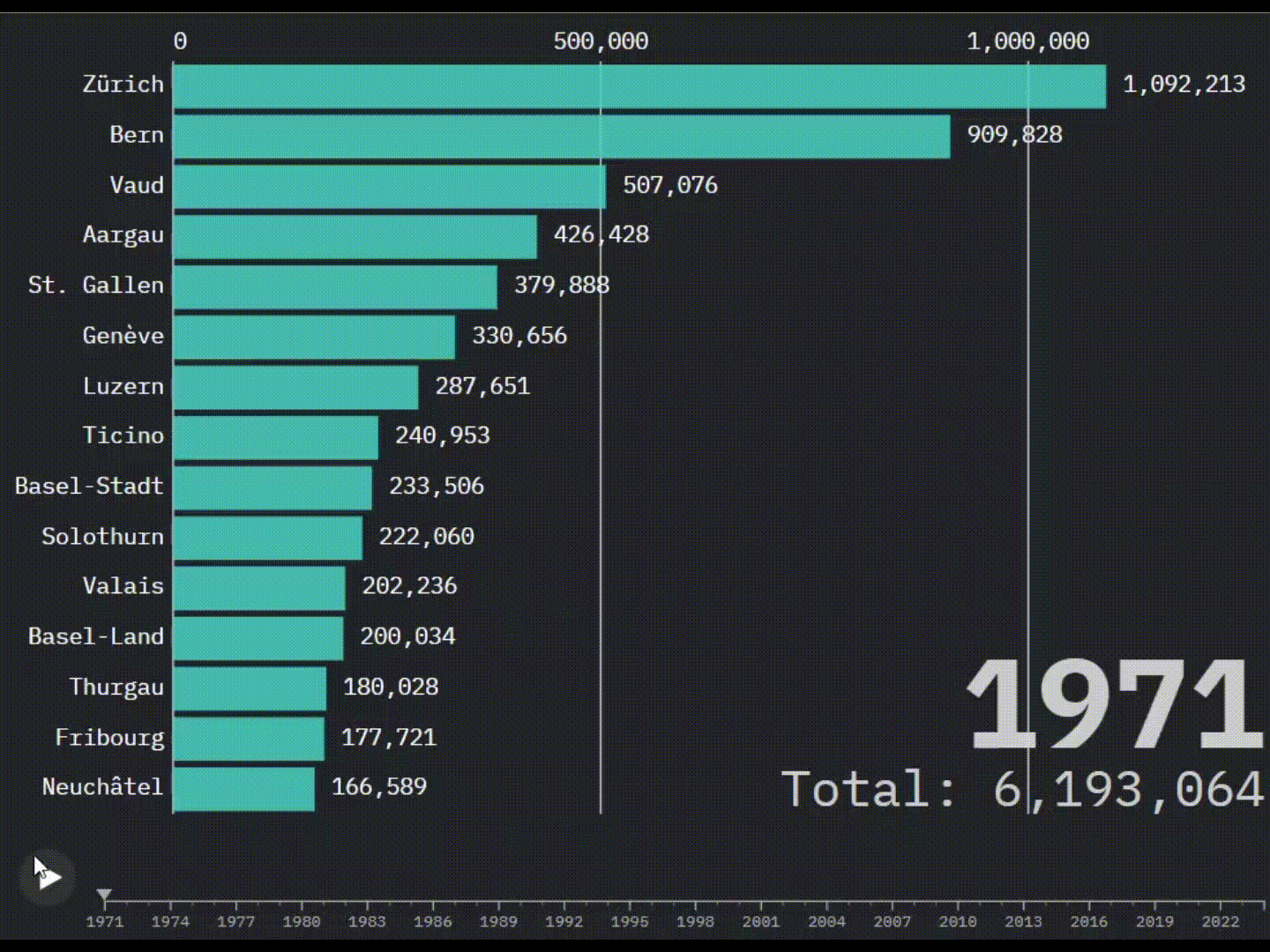
As the visualization runs year by year, Switzerland slowly reshapes itself.
And here are the key insights:
- Zürich is always the largest canton, and the gap keeps widening.
- Suburban cantons are the real winners. Cantons like Aargau and Thurgau grow fast. Classic “live outside the city, work in the city” behavior.
- Bern grows slowly for such a big canton. Despite being the second-largest canton, Bern’s population is surprisingly calm compared to Zürich or Vaud.
- French-speaking cantons show steady growth. Vaud, Geneva, Fribourg and Valais grow consistently, without big shocks.
- Around the year 2000, things speed up. For many cantons, population growth accelerates after 2000.
- COVID didn’t break the trend. Even around 2020–2021, there’s no dramatic drop. Growth slows a bit, but the overall direction stays positive.
Final Thought:
Sometimes movement reveals patterns faster than dashboards.
What might take several Power BI visuals becomes clear in seconds when the data moves year by year.. Moving Data, Moving People
3. Decomposition Tree = underrated visual
17 January 2026
This week I played around with a Decomposition Tree in Power BI. A visualization that I didn’t fully understand at first. It always looked cool, but I wasn’t sure when to use it. So I did a bit of research and turns out, it’s actually way more useful than I expected.
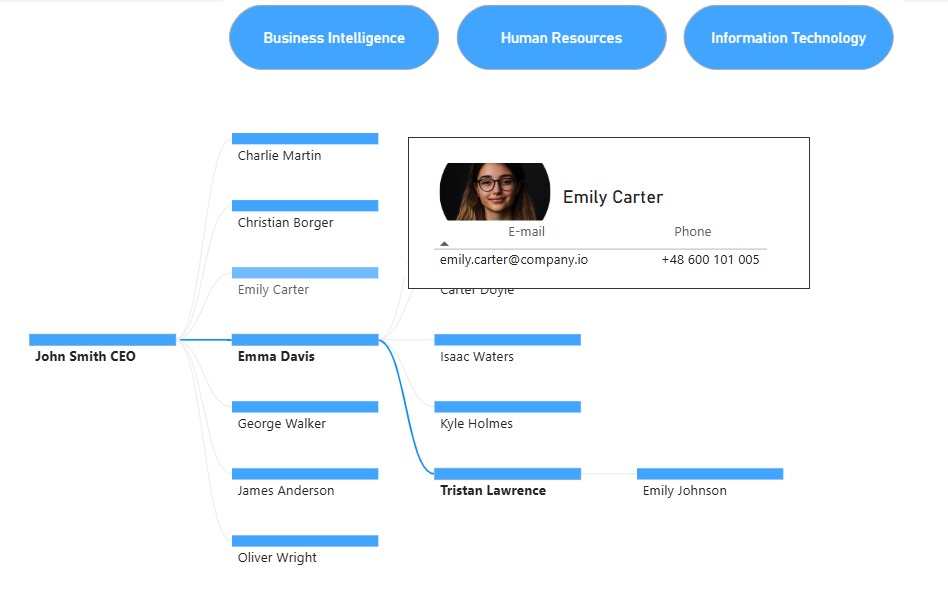
For this visualization, I used a dataset from datatraining.io, and I focused on showing an organizational structure. Having a decomposition tree of an organization is super helpful because it lets you quickly see how teams, roles, or departments are connected, who reports to whom, and where responsibilities are split.
A Decomposition Tree helps you break down a main value step by step into smaller parts, so you can clearly see what contributes to what. For example it can be used to analyze key metrics, such as revenue or costs, by breaking them down into factors like department, region or product category to quickly identify what drives performance changes.
Things I accidentally learned:
Even though I didn’t use it directly in this visualization, I learned about the AI-powered “Explain by” feature, which automatically analyzes the data and highlights the factors with the biggest impact such as High value or Low value contributors.
I also upgraded the tooltips by creating a dedicated tooltip page. This made them more informative, visually cleaner, and overall much more engaging than the default tooltips.
Overall, this visualization surprised me. It’s powerful and kind of fun to explore once you get the hang of it.
4. Learning to Ski with Data ⛷️
25 January 2026
As I’m going skiing for the first time in February, I decided to explore a ski resort dataset using Power BI. After some data cleaning, calculations, filtering, and conditional formatting, this visualization is the result.

This bar chart ranks the top 10 European ski resorts by their vertical drop – the difference between the highest skiable point and the lowest base station. The bar length represents the vertical drop in meters, while the color gradient (light to dark blue) indicates the summit altitude.
What stood out to me is how extreme some of these resorts are. Locations such as Chamonix and Zermatt–Matterhorn combine large vertical drops with very high altitudes. While this makes them iconic destinations, it also suggests more challenging conditions that may not be ideal for beginners.
Another insight: High Summit ≠ Always Highest Drop. Veysonnaz/Thyon have larger drops than Cervinia but lower summits which means deep valleys matter as much as high peaks.
The personal insight:
Even though Zermatt is one of my favorite places in Switzerland, this chart made me rethink it as a learning destination. So while my heart says Zermatt, my data says maybe start somewhere else.
